Plotting
Default Plot Method
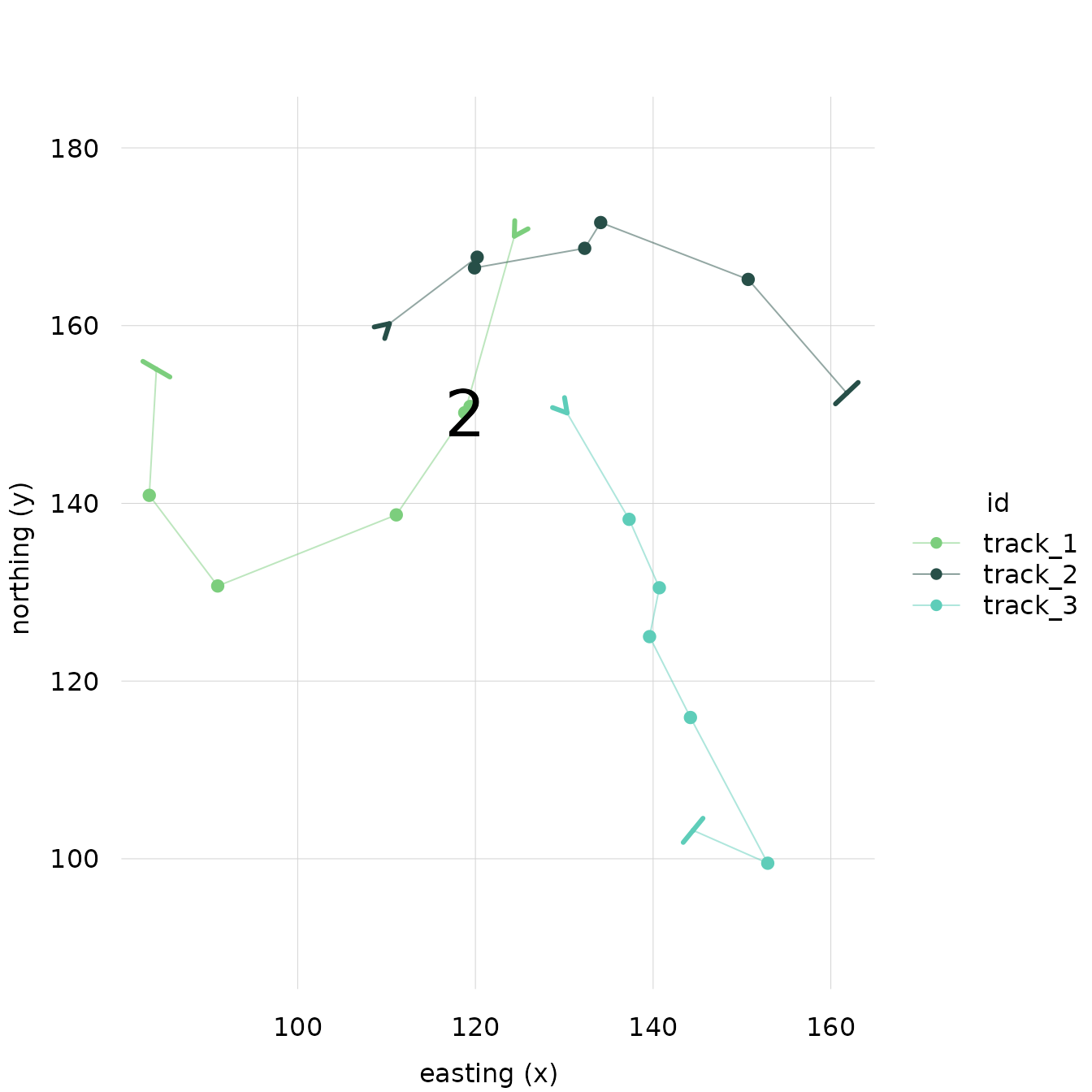
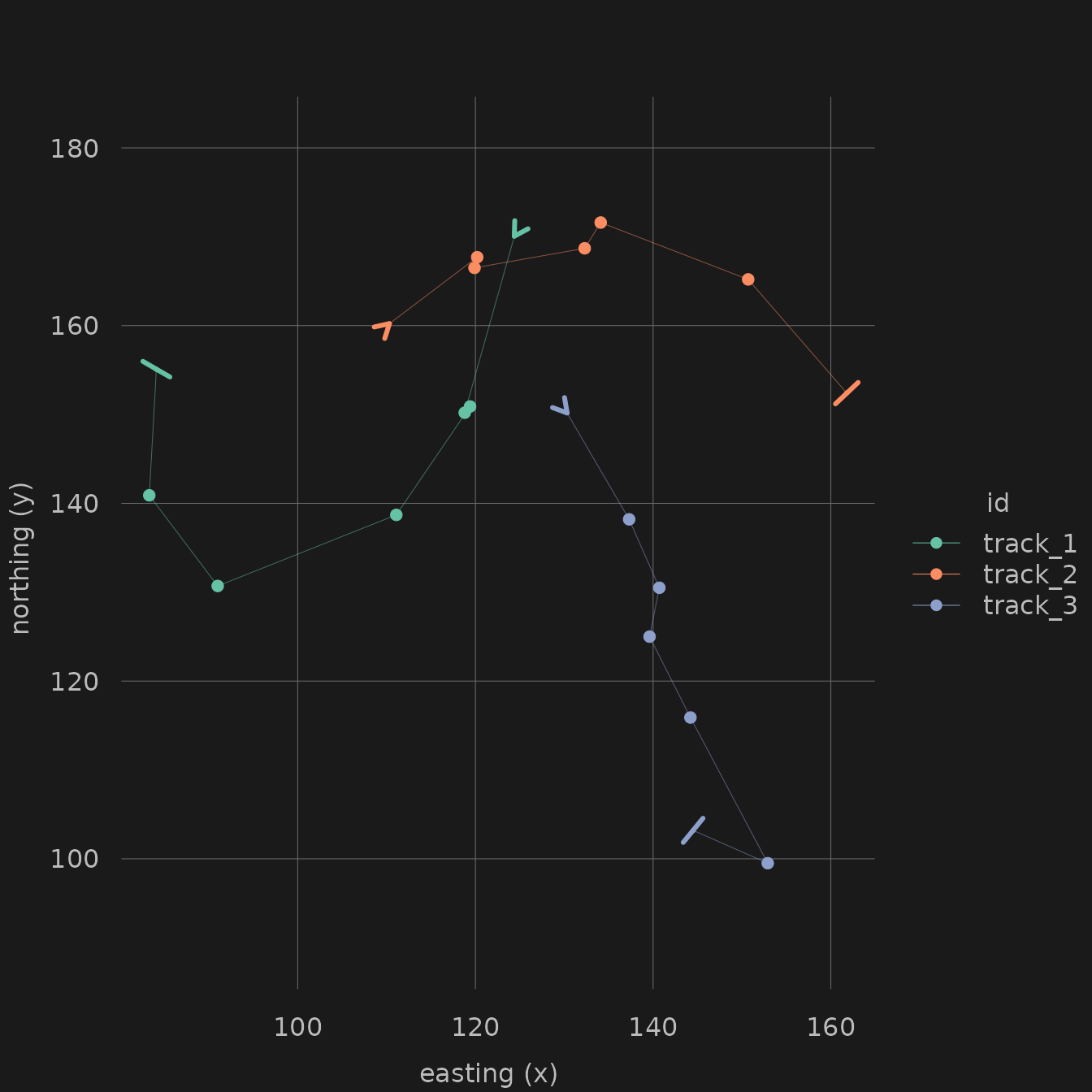
Running the plot function on a trackframe
creates a plot of the location points, joined by lines in temporal
order, with easting on the x-axis and northing on the y-axis. By
default, all tracks are plotted with an aspect ratio of 1, each in a
different color. The start point of each track is marked by an
arrowhead, and the end point of each track is marked by a bar.
library(trackframe)
df_demo
## x y id time
## 1 124.4 170.1 track_1 1
## 2 118.8 150.2 track_1 2
## 3 119.4 150.9 track_1 3
## 4 111.1 138.7 track_1 4
## 5 91.0 130.7 track_1 5
## 6 83.3 140.9 track_1 6
## 7 84.1 155.1 track_1 7
## 8 110.3 160.2 track_2 1
## 9 120.2 167.7 track_2 2
## 10 119.9 166.5 track_2 3
## 11 132.3 168.7 track_2 4
## 12 134.1 171.6 track_2 5
## 13 150.7 165.2 track_2 6
## 14 161.8 152.4 track_2 7
## 15 130.3 150.2 track_3 1
## 16 137.3 138.2 track_3 2
## 17 140.7 130.5 track_3 3
## 18 139.6 125.0 track_3 4
## 19 144.2 115.9 track_3 5
## 20 152.9 99.5 track_3 6
## 21 144.5 103.2 track_3 7
tf_demo <- as.trackframe(df_demo, crs = NA)
plot(tf_demo)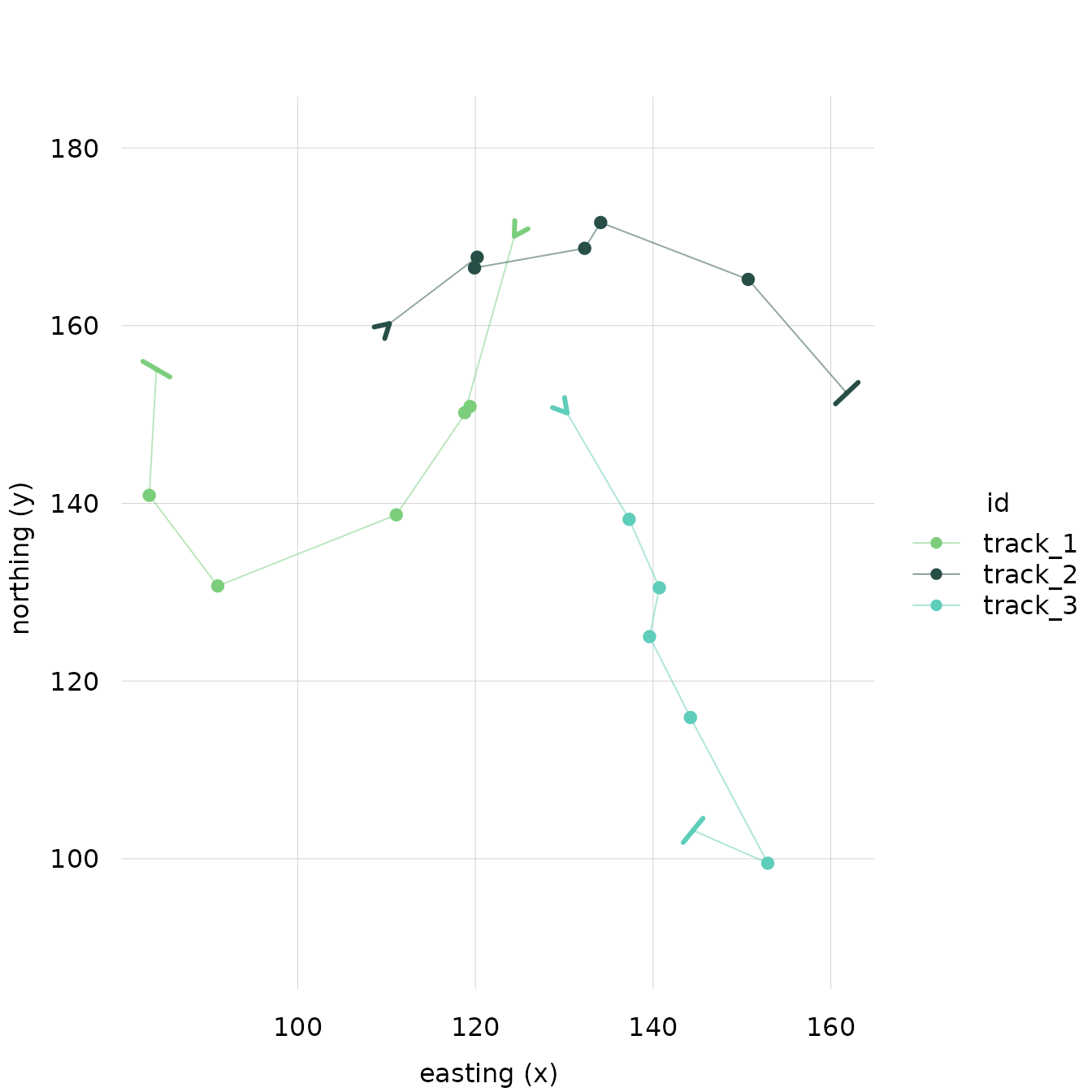
Customizing Default Plot Method
trackframe’s plotting functions are based on the
tinyplot package
(vignette("introduction", package = "tinyplot")). This
means that it responds to largely the same parameters as base R plots,
and that tinyplot’s syntax can be used.
Controling Visible Elements
Each element of the plot (lines, points, start indicators and end indicators) can be turned on and off.
For example, if you want to show lines only:
plot(tf_demo, points = FALSE, start_indicator = FALSE, end_indicator = FALSE)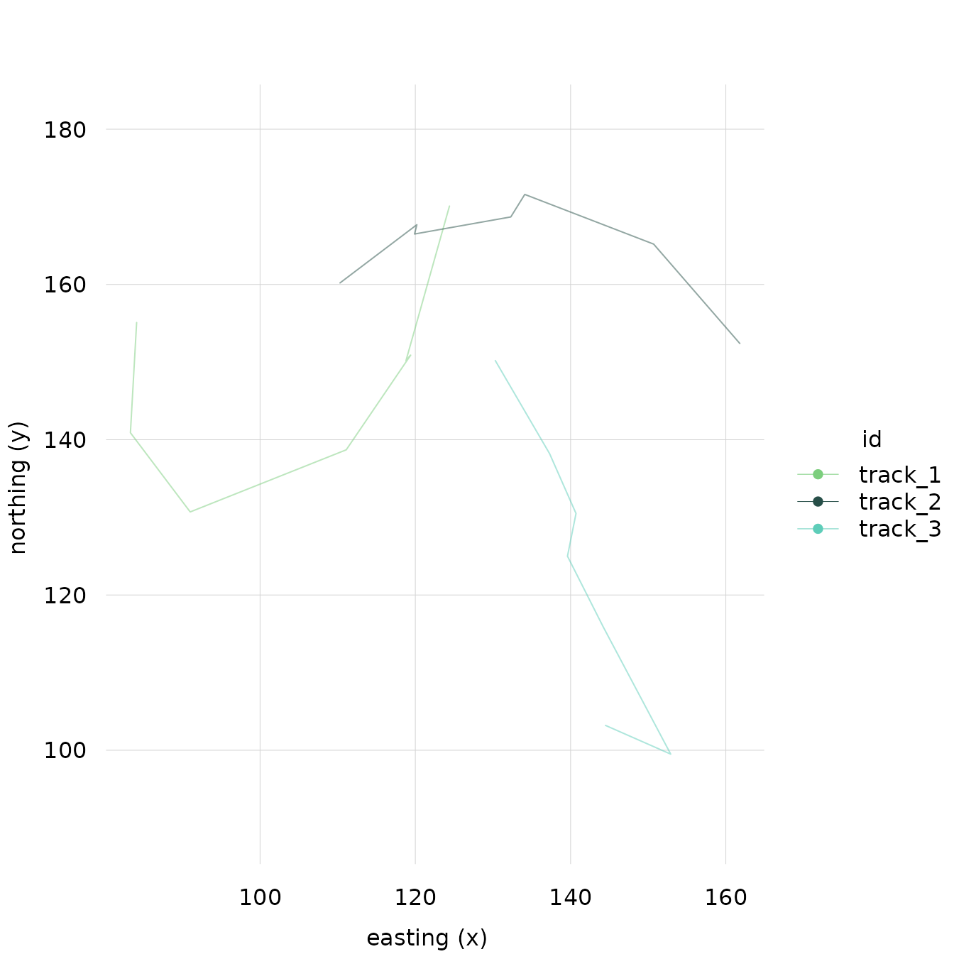
Or points only:
plot(tf_demo, lines = FALSE, start_indicator = FALSE, end_indicator = FALSE)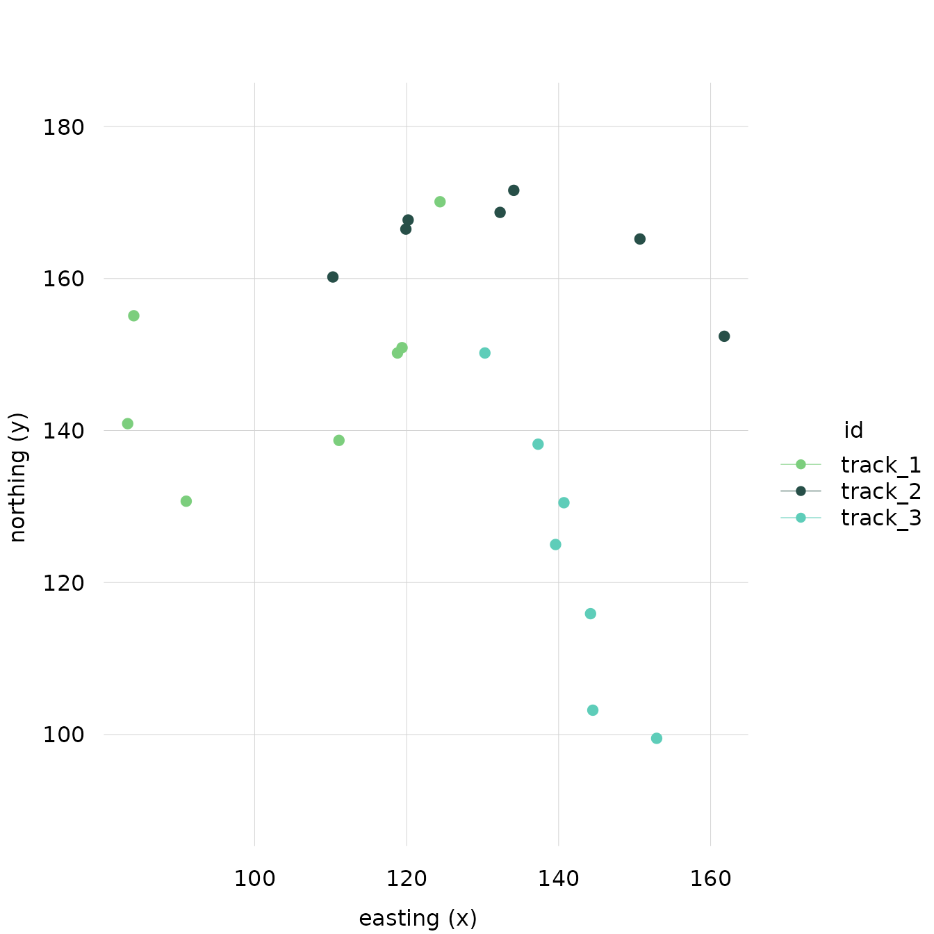
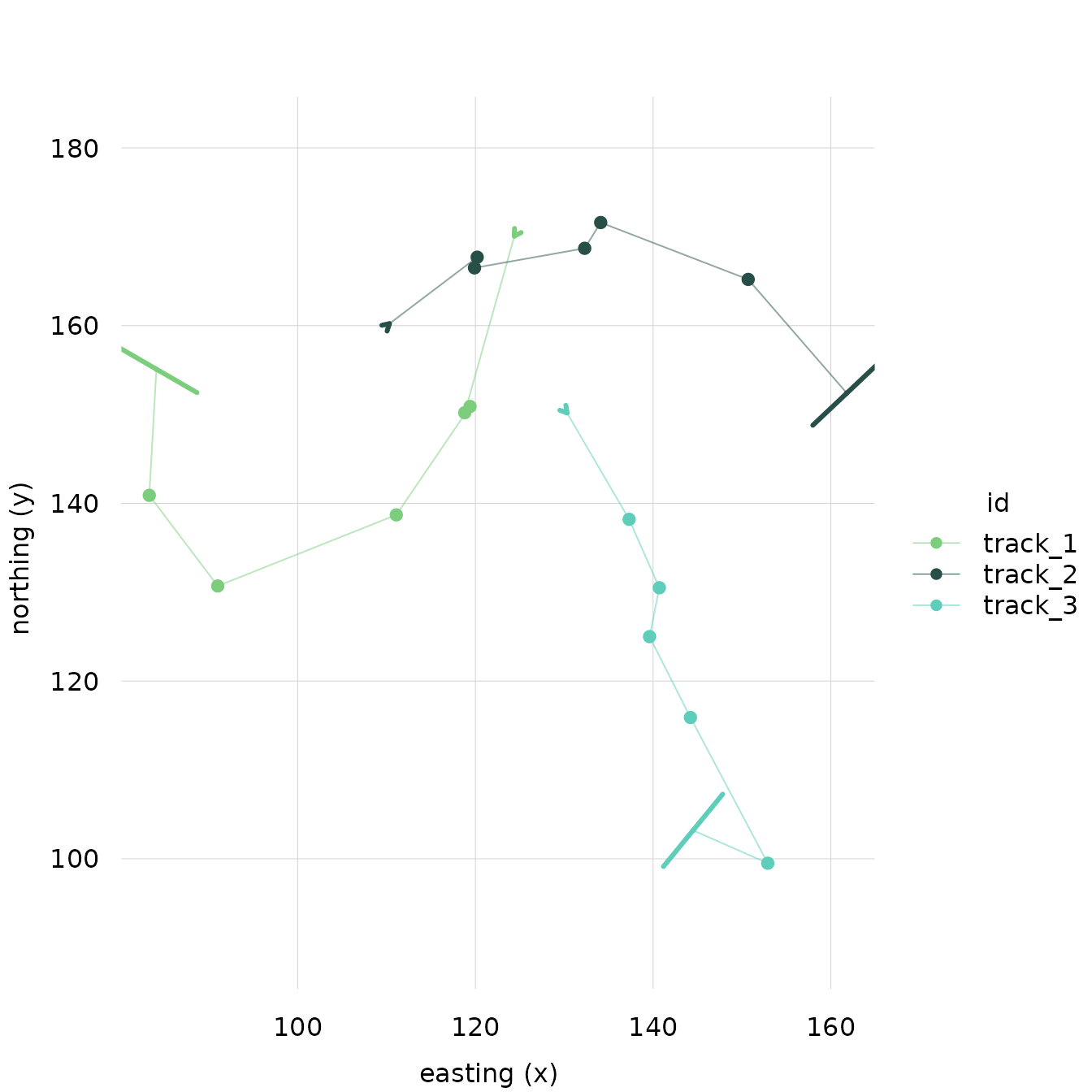
Changing the Theme
You can also change the theme of the plot to any of
tinyplot’s built-in and custom themes. For example:
# Reset theme
tinyplot::tinytheme()
The full range of tinyplot themes is shown here:
(vignette("themes", package = "tinyplot"))
Adjusting Styles
The style of individual elements can also be adjusted by passing
parameters as a list to that element’s corresponding _style
argument.
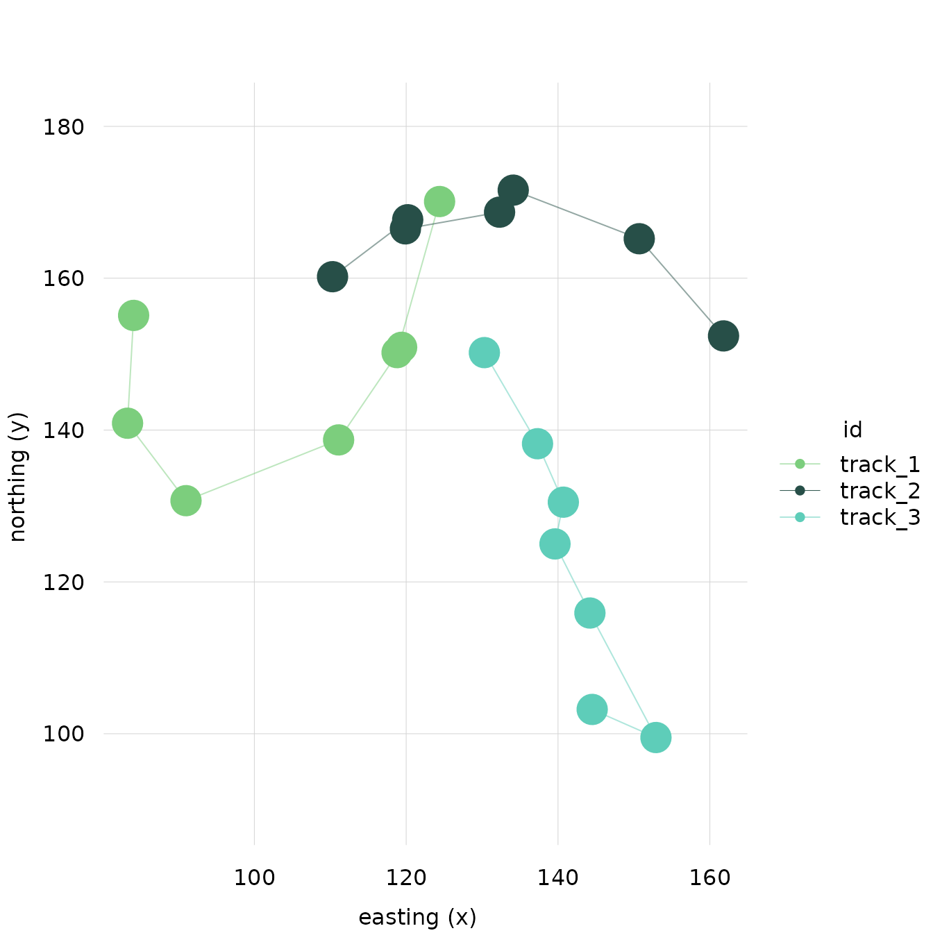
For example, if you want the points to be large, you can adjust the
cex in a list of the points_style
argument:
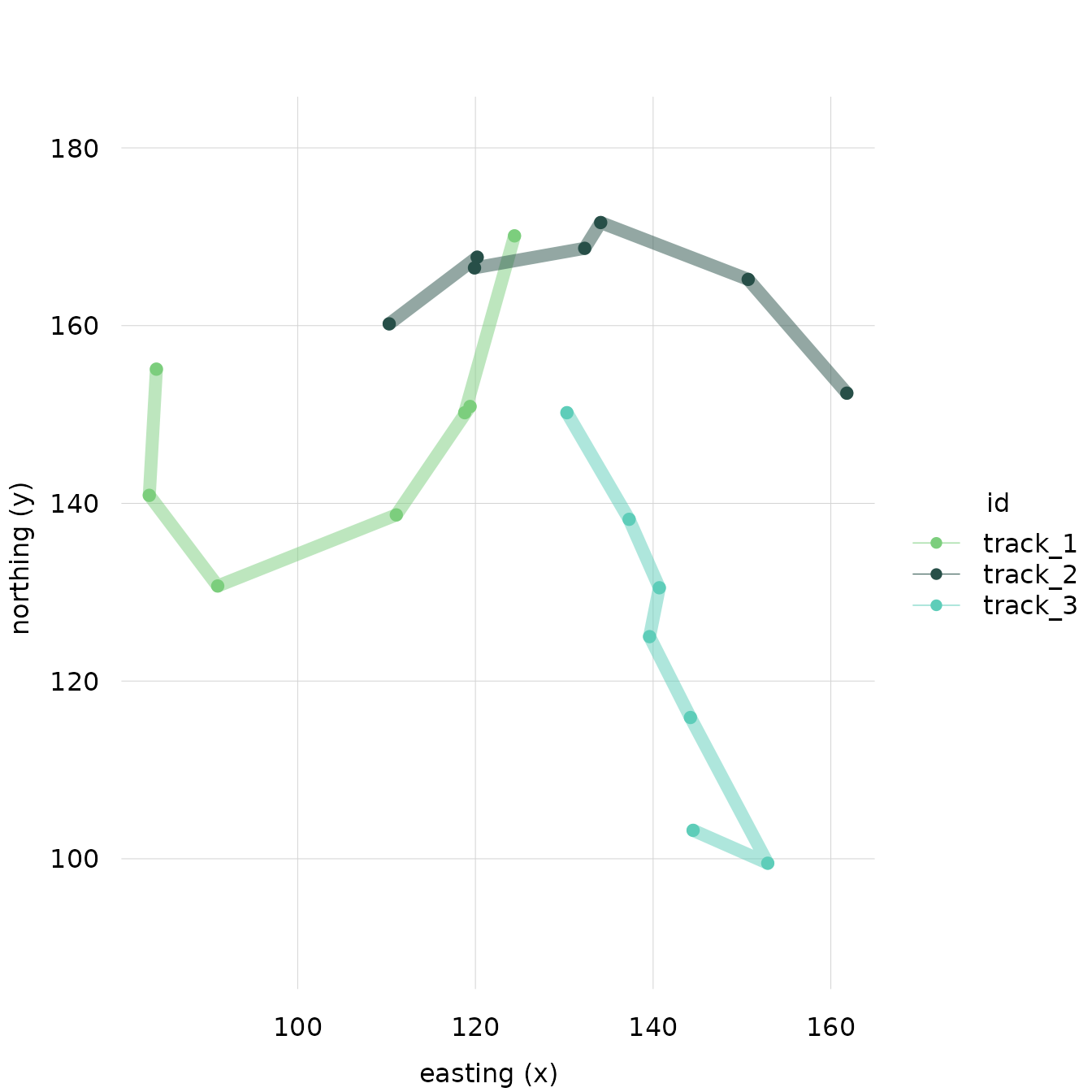
If you want to change the line thickness, you can change the
lwd in a list of the lines_style argument:
These styling lists (and the plot() method itself) take parameters
passable to tinyplot::tinyplot. This includes parameters defined in
graphics::par …
plot(tf_demo, col = "blue")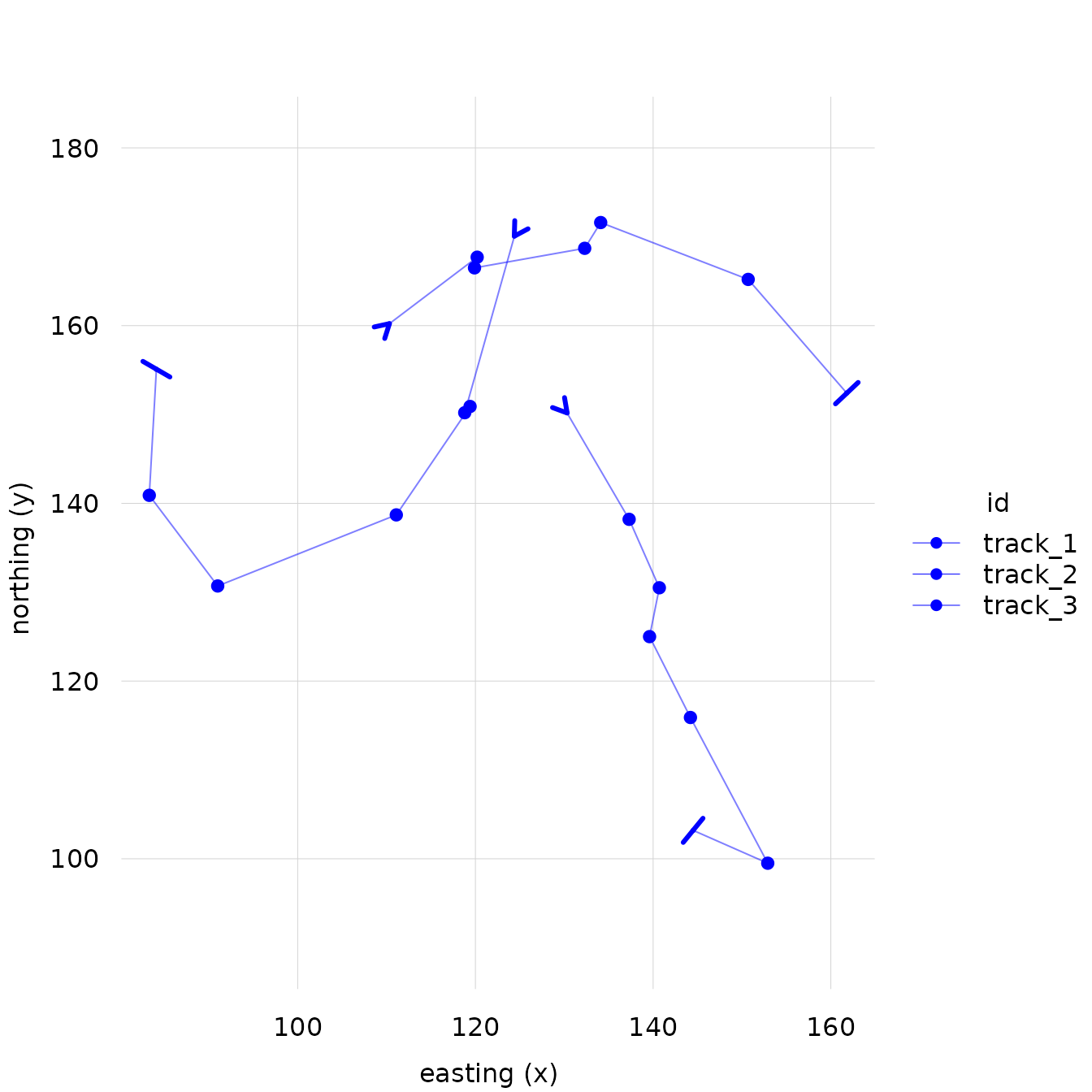
… as well as parameters defined directly in
tinyplot::tinyplot.
Parameters that apply to the entire plot, not just one element, can
be passed directly to plot(...) rather than in a
_style list.
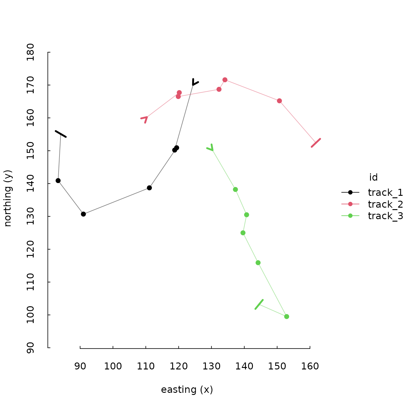
plot(tf_demo, legend = FALSE)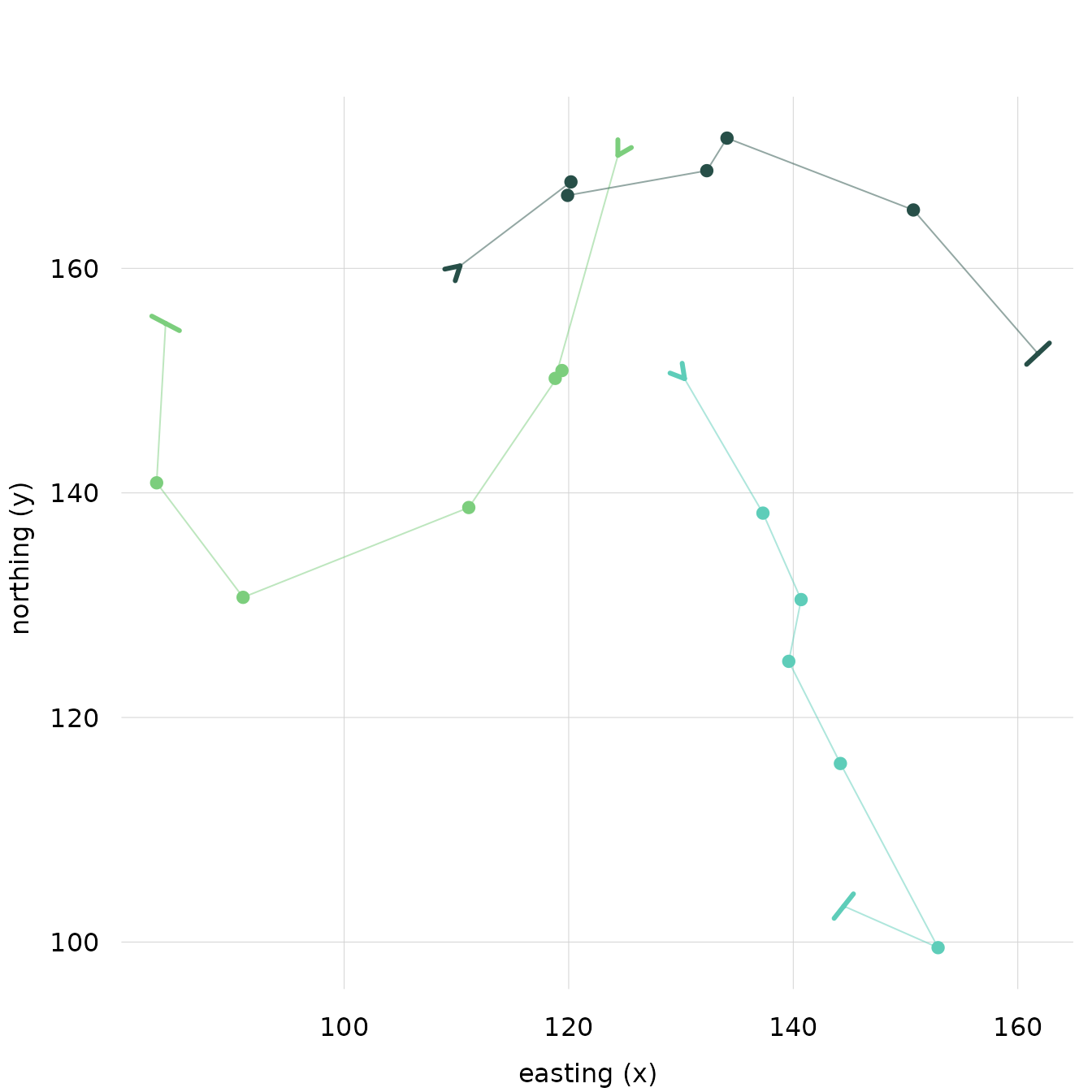
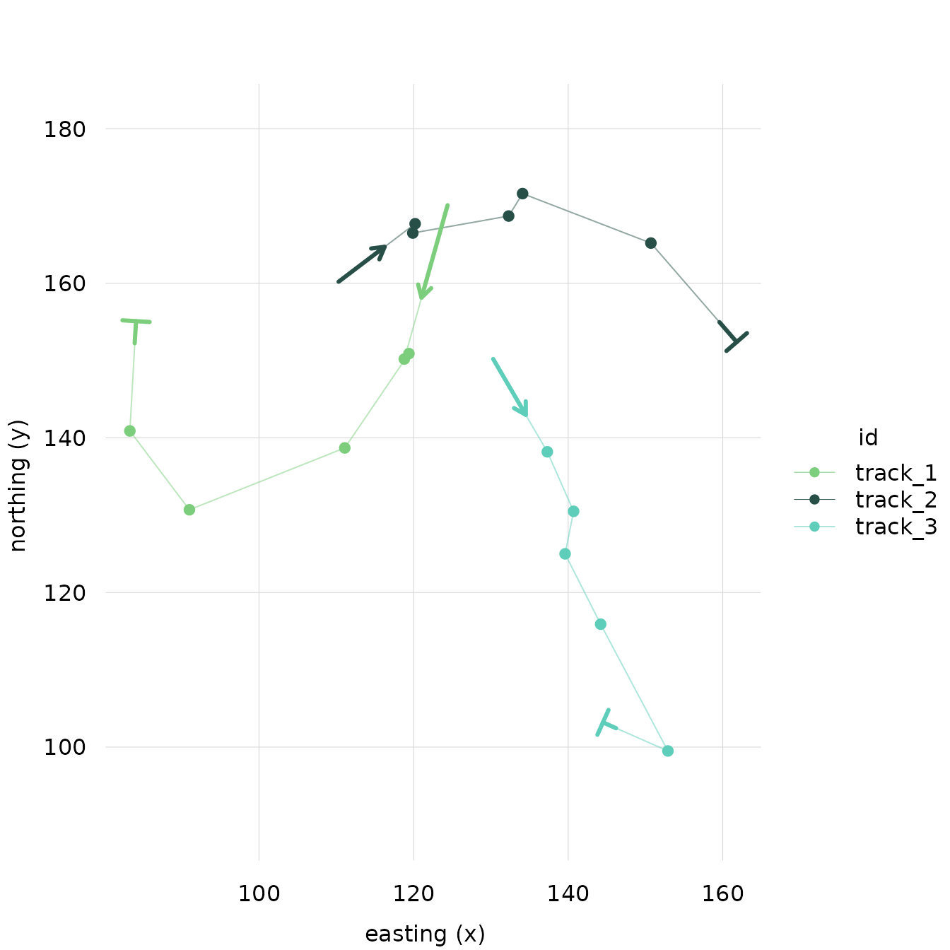
Adjusting Indicators
The start and end indicators are arrows. Their style can be adjusted as well using parameters that apply to arrows.
For example, you can adjust the size of the arrowhead with the
length parameter.
We can make the end indicators big and start indicators tiny:
You can also use the arrowhead_loc parameter to move the
arrowhead away from the exact start/endpoint of each track toward the
second/second-to-last point.
For example, this puts the start arrowhead 60% of the way between the first point of each track and the second point of each track, and puts the end arrowhead, 20% of the way between the last point in each track and the second-to-last point:
plot(
  tf_demo,
  start_indicator_style = list(arrowhead_loc = .6),
  end_indicator_style = list(arrowhead_loc = .2)
)
Plotting Markers
If you want to highlight certain non-endpoints, create an indicator
column with the points you’d like to highlight marked as
TRUE and all others marked as FALSE. Then,
pass the name of the column to the plot() method as the
marker arg.
# Create an indicator column, all points marked as FALSE
tf_demo$track_1_2nd_point <- FALSE

# Mark the 2nd element of track_1 as TRUE
tf_demo$track_1_2nd_point[id(tf_demo) == "track_1"][2] <- TRUE

plot(tf_demo, marker = "track_1_2nd_point")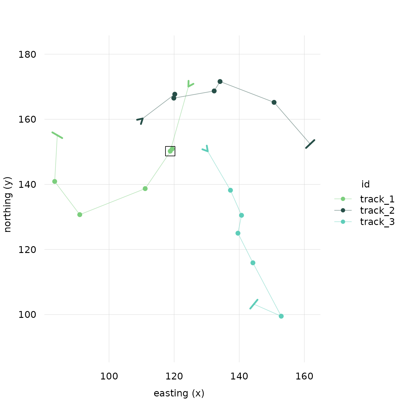
By default, makers appear as boxes around the relevant datapoint.
Similar to other elements, they can be styled with
marker_style.